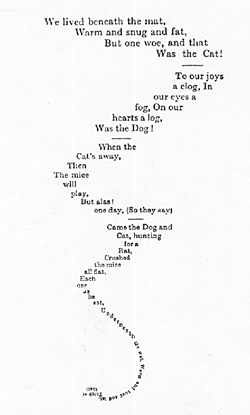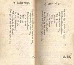
In this second installment of our March 2010 theme, “The Page Transformed: Intersections of Poetry & the Visual Arts,” we’ll be thinking about poetry which makes use of the visual elements of its form to create and enhance meaning. Although the term “concrete poetry” was not coined until the 1950’s, poets were using elements of design and typography long before then. George Herbert’s shaped poems (like “Easter Wings”) and Lewis Carroll’s “A Mouse’s Tail” are two particularly classic examples, while a more contemporary example might be the typographical experiments of e.e. cummings (as in his poem “r-p-o-p-h-e-s-s-a-g-r“). Thinking of the page as a space by which to convey both verbal and visual meaning paved the way for surrealist experiments with exercises like cut-up technique, which employs elements of collage to create new poems by disassembling and rearranging existing words on the page (The Academy of American Poets’ Website has an interesting article on Futurism, Dada, and Concrete Poetry). Today, visual poetry is now a field unto itself (The Poetry Foundation has a wonderful article about the subject if you’re interested in exploring more).

As we think about The Page as Canvas, we’ll be looking not only at writers who employ strategic visual elements to put forth their poetics, but also at the importance of elements like book design, cover art, illustration, and print formats like broadsides, which really do turn text into pieces of visual art. As we move forward into the technical elements of producing the physical page, our explorations will turn us towards the third phase of our series, in which we’ll examine The Book as Object.