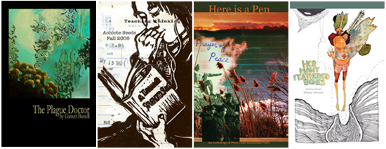
Last week in our series “The Page Transformed: Part II – The Page as Canvas,” we spoke to poet Craig Santos Perez about his strategic use of visual elements like typesetting and illustrations in his poetry. In this post, we’ll be focusing on his small press, Achiote, in order to learn how decisions about developing the nuts-and-bolts aspects of a book’s visual impact — like cover art and book design — are made.

Achiote Press, a Berkeley-based press edited by Craig Santos Perez and Jennifer Reimer, publishes poetry and art in a range of print formats, including chapbooks, perfect-bound books, anthologies, and art books. Each season, they put out limited-run editions of two single-author chapbooks and an issue of their unique publication, Achiote Seeds, which their blog describes as a “multi-author chap-journal.” Browsing through the beautiful covers on Achiote’s web site, one gets a sense of just how thoughtfully the design of each book has been selected in order to complement the work contained within. That Achiote has a dedicated Art Director, Jason Buchholz, is even more indicative of just how important the idea of a book as a physical art object is to the press.
We asked Jason to talk to us about Achiote’s aesthetic vision and his role as the decisionmaker behind Achiote’s “look”. Here’s what he had to say about his process:
“I allow our overall aesthetic to emerge from the works themselves. I read each manuscript carefully, in search of two things: recurring visual imagery, and a distilled sense of the overall emotionality of the work. In other words, I try to experience a manuscript as if it were a visual work, translating movement, change, and the other temporal qualities of writing into a single impression. I then look for an image that will match that impression, as well as the title. The role of the title here can’t be understated – it’s the interplay of image and title that not only gives the book its initial impact,
but also creates an inescapable psychological context for reading the words inside. My primary goal with each cover is to ensure that this context remains true to the writer’s intentions. If I’m working on an anthology, I’ll try to match the unifying theme, rather than specific images or feelings. In those rare cases that we publish collections without strong themes, I simply use the opportunity to showcase a great piece of work I want the world (or at least our readership) to
see. Our overall aesthetic, then, is the sum total of all these book covers, plus my personal contributions of a simple logo and a dash of orange.
In the future I hope to produce more works that place art and writing on equal footing. Just this week we released Her Many Feathered Bones, which sees an artist and a poet on equal footing, in a slow and deliberate dialogue in which neither art form is given precedence. To me this represents the beginning of a new aesthetic that emerges almost entirely from our artists and their work. In such cases, I will have very few decisions to make. My role will be that of front-row observer, part-time quality assurer, and occasional matchmaker.”
Thanks very much to Jason for taking the time to offer his thoughts to us, and to Craig Perez for passing our questions on to him. Please do take the time to visit Achiote’s web site and browse through the covers from their current list and archives — they are truly gorgeous, and are testament to the love, taste, and meticulous attention that goes into each of Jason’s design choices.
Jason Buchholz is an artist, writer, and editor living in El Cerrito, CA. Someday his work will be available at jasonbuchholz.com.